Theme Primitives — Colors, Fonts & Raw Building Blocks
Table of Contents
Theme Editing Panel — The Primitive Tab
The Primitive Tab is the foundation of your website's entire design. Think of it as your raw building blocks! Everything else on your site — every single button, block, and page — copies its style from the values you set here.
This panel is smartly split into four easy sections you can scroll through: Colors, Fonts, Layout, and Effects.
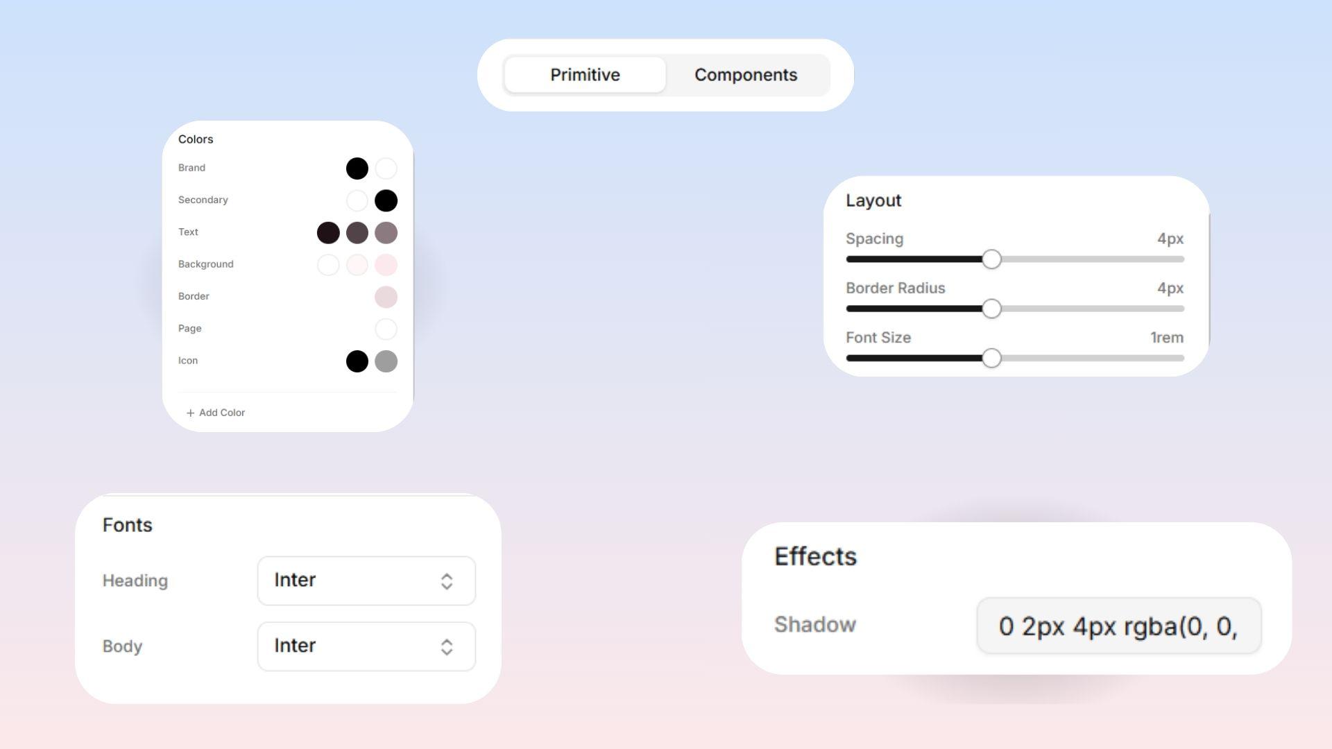
Colors
Your Brand Colors
Brand Main: Your most important brand color! This is used for your big primary buttons, clickable links, and important highlights.
Brand Foreground: The color of the text or icons that sit on top of your Brand Main color. (This is usually pure white or very dark, so it's easy to read).
Secondary Brand Colors
Secondary Main: A nice backup color used for less important actions or subtle accents.
Secondary Foreground: The text or icon color that sits on top of your Secondary Main color.
Text Colors Levo Studio uses a three-level system to keep your text organized:
Text 1: Your main text color, used for major headings and important paragraphs.
Text 2: A softer color for less important text, like subheadings and small captions.
Text 3: The lightest, most faded color for things like search bar hints or minor background details.
Background Colors Just like text, your backgrounds have a three-level system too:
Background 1: Your main, overall page background (usually the lightest color).
Background 2: A slightly different background used for separate sections or floating "card" boxes.
Background 3: Your deepest background, perfect for dark side-panels or the bottom footer of your website.
Other Handy Colors
Border: The color of the thin lines dividing sections or outlining boxes.
Page Background: The far-back canvas color that sits totally behind your actual page content.
Icons: Set the default colors you want your icons to be across your whole site!
Custom Colors Need an extra color? Just click Add Color! Any custom colors you make here will instantly become available everywhere on your site.
Checking Your Contrast  Levo Studio automatically checks if your colors are actually easy to read when they are placed next to each other! The system helps you out by giving you a quick rating:
AAA: Excellent! Passes all accessibility standards with flying colors.
AA: Acceptable! Meets the basic standards for reading.
Fail: Uh oh. Too low-contrast, making it very hard to read or see.
Remember: Poor contrast makes your website frustrating for people to use. Always aim for at least an "AA" rating on your text colors!
Layout
These three controls set up the basic ground rules for your site's shapes and spacing:
Spacing: Think of this as the base measurement for spacing across your whole website. If your page looks extremely squeezed and crowded, making this number bigger will instantly give everything on the site more breathing room!
Border Radius (Rounded Corners): Controls how sharp or soft your buttons and boxes look by default.
Low (0–2px): Sharp, structured, and highly professional.
Medium (4–6px): Balanced and modern.
High (8px+): Very rounded, giving a friendly and soft feel.
Font Size: This acts like a giant "zoom" dial for all the text on your website! It shrinks or enlarges every single font globally all at once.
Fonts
Heading Font: The font used for all big titles and headings. Pick something expressive here that shows off your brand's personality!
Body Font: The font used for everyday paragraphs. Make sure you pick something simple that is very easy to read at small sizes.
 Design Tip: A great trick is to pick a fun, unique font for your Headings, and a very plain, clean font for your Body text. This makes things look incredibly professional!
Custom Fonts Want more options? Just click "Add Font", give it a name, and search through the massive Google Fonts library! It will instantly become available across your entire site.
Effects
Shadow: This sets the default shadow style for your entire website. If you define your favorite-looking shadow here, it will automatically look perfectly consistent on every single card or dropdown menu you ever create!
After all your changes, don’t forget to press SAVE at the bottom of the panel 💡