Theme Components — Styling Buttons, Headings & More
Table of Contents
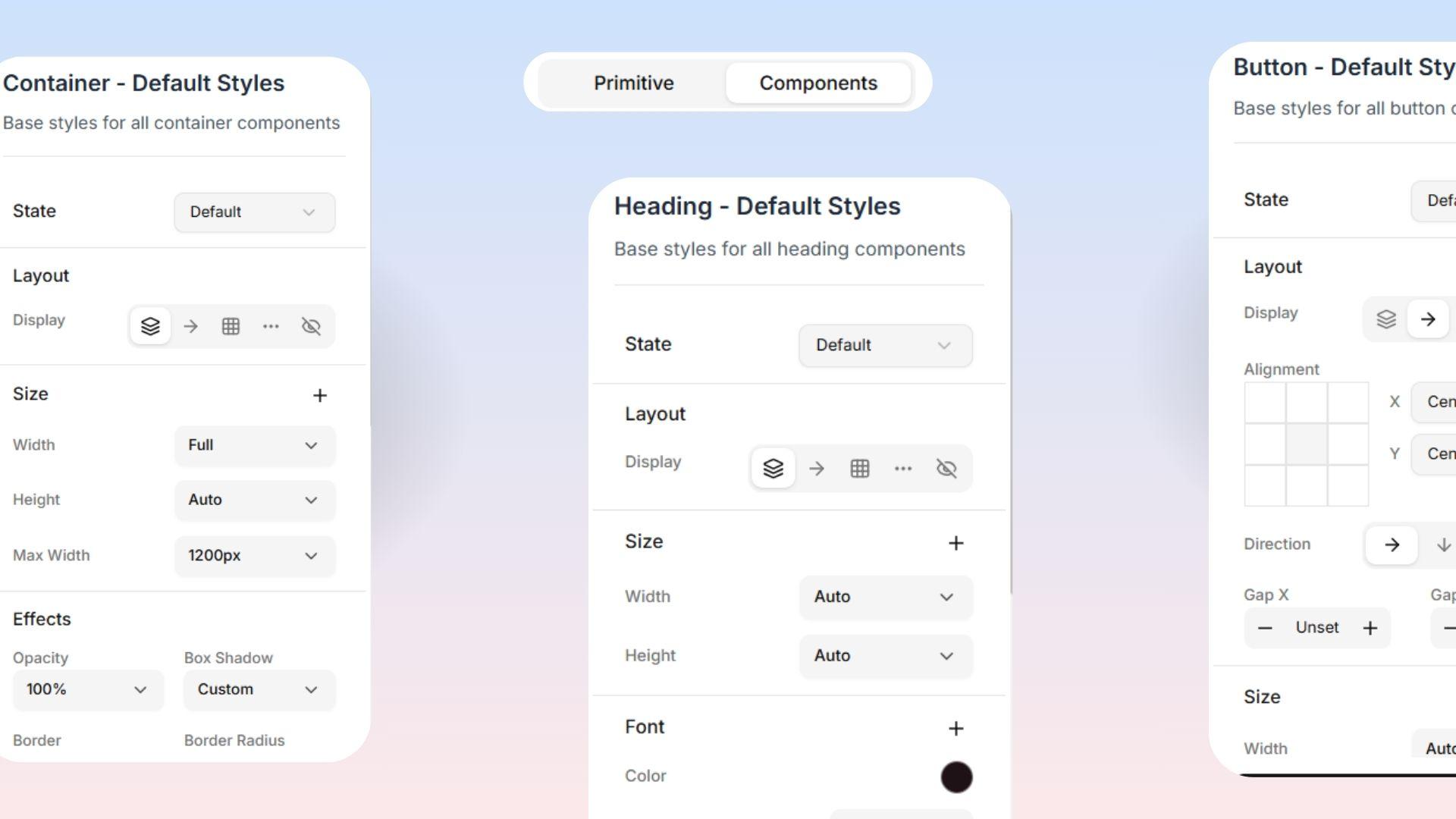
Theme Editing Panel — The Components Tab
While the Primitive tab gives you raw building blocks (like colors and fonts), the Components tab lets you use those blocks to build specific items! Here, you get fine control over the major pieces of your website.
Just click on any component type (like a Button or a Heading) to access its style controls. When you click one, the preview panel will automatically zoom in so you can see exactly what you are doing!
Available Components to Edit
Headings This controls the size and style of every heading on your site, from the massive H1 (your biggest title) all the way down to H6 (the smallest title). You can customize the size, thickness, and spacing for each level to fit your brand perfectly!
Buttons Levo Studio comes with several pre-built button "variants" (styles) that you can fully customize:
Primary: Your main, most important button (like "Buy Now" or "Sign Up").
Secondary: A supporting button used for less important actions.
Outline: A button with a colored border but a totally see-through background.
Ghost: The most minimal button, with no background or border at all.
Destructive: Used for dangerous actions like deleting something (usually colored red as a warning).
Link: Styles the button so it looks exactly like a normal text link!
You can also adjust how big these buttons are, from Extra Small up to Large.  The Magic Trick: If you change how your "Primary" button looks here, EVERY single primary button across your entire website will instantly update to perfectly match!
Typography (Text Styles) This covers all the different types of normal text on your site:
Body: Your standard, everyday paragraph text.
Lead: A slightly larger text style used for introductions.
Large: Extra big text for important callouts.
Small: Tiny text used for footnotes and minor details.
Caption: Perfect for tiny image labels.
Muted: Faded, lighter text so it doesn't distract the reader.
Quote: Beautiful styling for long quotes or testimonials.
Code: Special "typewriter-style" spacing for showing code snippets.
Containers This controls how wide the invisible boxes holding your content are allowed to stretch:
Full Width: Stretches all the way from edge to edge on the screen.
Wide: Very wide and generous.
Narrow: Keeps text columns thin and focused, making them very easy to read.
Content: The standard, readable width for most pages.
Sections This controls the vertical space (the top and bottom cushioning) for the big sections of your page:
Compact: Very minimal spacing.
Default: The standard, balanced spacing.
Spacious: Gives your sections tons of generous breathing room!
None: Absolutely zero cushioning at all.