Element States — Styling Hover, Disabled & Active
Table of Contents
Items on your page actually change how they look when a user interacts with them! Levo Studio lets you easily style these different "states", giving you total control over how your website responds to your visitors.
The Four Layout States
You can choose from four different states to style:
Default: The normal, everyday look of your item when nobody is touching it. (This is where you will do most of your styling).
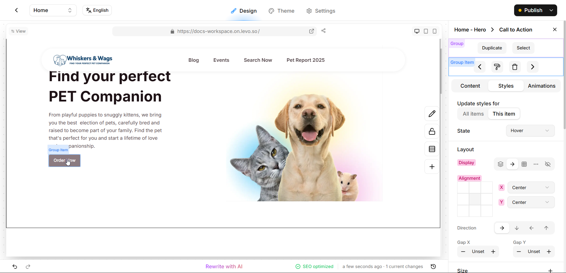
Hover: How the item looks when a visitor places their mouse over it! Adding a hover effect (like a button getting darker, or a picture zooming in slightly) is a great way to show visitors that an item is clickable.
Disabled: How an item looks when it is completely "turned off" and unclickable (like a greyed-out "Submit" button before a user fills out a form).
Active: How an item looks when it is currently selected or turned "on" (like highlighting the specific tab menu you are currently reading).

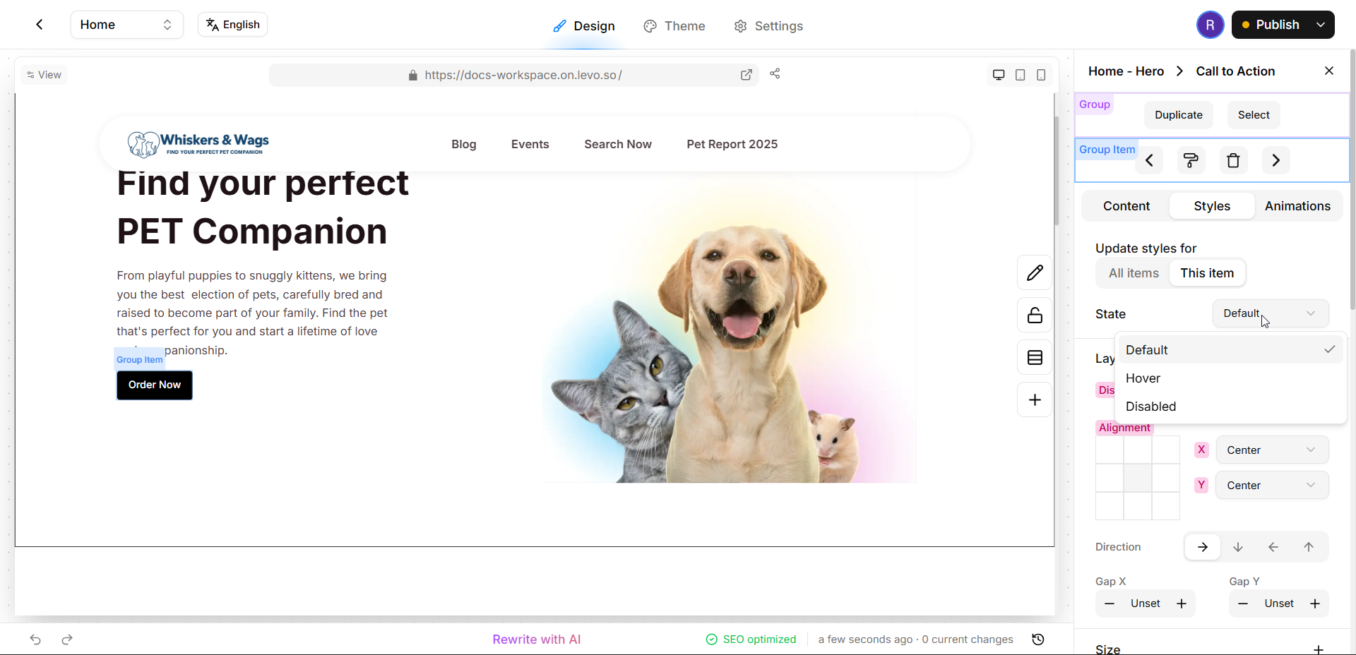
How to Style a State
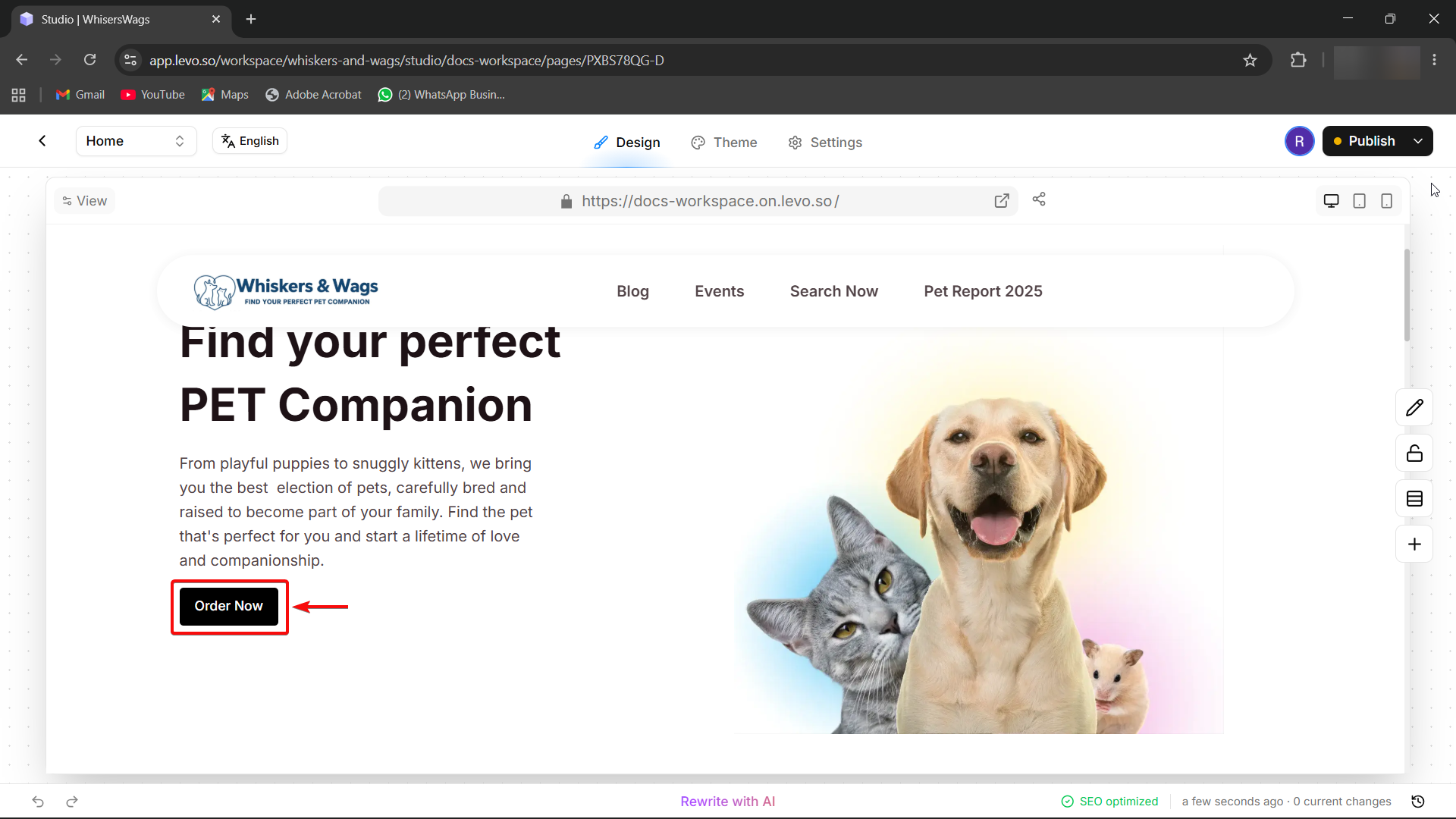
Click on the item you want to style (like a button or a card).
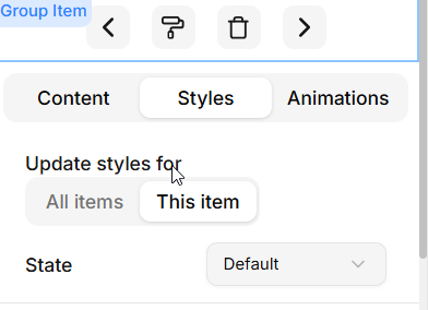
"Look at the Style tab in the Edit Block Panel on the right side of the screen, find the “State Selector,” and pick the state you want to change (like Hover)."
Make your styling changes! The canvas will show you a live preview (e.g, the color of the button changes on hovering).
When you are finished, just switch the selector back to Default to resume your normal editing!
Fun Examples to Try!
Make a Button Glow: Select the Hover state and change the background color to be slightly lighter or brighter.

Make a Card Lift Up: Select the Hover state, make the Drop Shadow larger, and move the Y-Offset up slightly to make the card look like it's floating off the page!

States on Different Devices
You can even combine States with your Mobile or Tablet views! Just select your Tablet or Mobile view at the top of the screen first, and then adjust your states to create special effects that only happen on smaller screens.