Controlling Size & Spacing
Table of Contents
Two of the most important things you can control are the size of an item, and the empty space inside and around it. Getting this right is the secret to making your page look clean and professional instead of cramped or messy.
Size
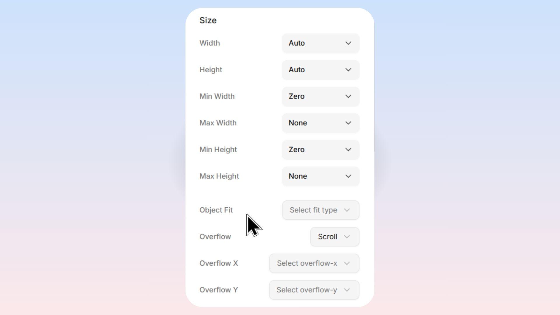
Width and Height
Every element on your page has a Width and Height that you can control. Levo gives you several sizing options so you can make things look perfect on every screen size.
Sizing Controls Available
Levo lets you set up to six dimension properties on any element:
Property | What It Controls |
|---|---|
Width | How wide the element is |
Height | How tall the element is |
Min Width | The smallest width the element is allowed to shrink to |
Max Width | The largest width the element is allowed to grow to |
Min Height | The smallest height the element is allowed to shrink to |
Max Height | The largest height the element is allowed to grow to |
[!TIP] Min and Max are great for responsive design. For example, you might set a text box's width to
100%(so it stretches on big screens) but set a Max Width of600pxso it never gets too wide and hard to read.
Sizing Modes
When you click on any dimension property, a popup appears with the following sizing options:
1. Auto (Default): Adjusts based on content — grows or shrinks automatically.
2. Custom: Set an exact size (e.g. 400px, 50%).
3. Full: Fills 100% of its parent container.
4. Screen: Fills the entire screen (viewport).
5. Min Content: Shrinks to the smallest possible size without breaking content.
6. Max Content: Expands to fit all content in one line (no wrapping).
7. Fit Content: Fits content but stays within the parent container.
Special Options for Min and Max Properties
When you are editing Min Width, Min Height, Max Width, or Max Height, you will see some extra options:
Option | Appears On | What It Does |
|---|---|---|
None | Max Width, Max Height | Removes any maximum limit — the element can grow as large as it wants. This is the default for max properties. |
Zero | Min Width, Min Height | Sets the minimum to zero — the element is allowed to shrink all the way down to nothing. This is the default for min properties. |
Custom Units Explained
When you choose the Custom sizing mode, you type in a number and then pick a unit from a dropdown. Here are all six units available:
px (Pixels): A fixed, exact measurement.
1pxis one tiny dot on the screen.
2. % (Percentage): A relative measurement based on the parent container's size.
Example: If the parent is
800pxwide and you set the element to50%, it becomes400pxwide.Best for: Responsive layouts — elements that need to stretch and shrink proportionally. Great for columns (e.g., two columns at
50%each).
3. em: A relative measurement based on the font size of the element itself (or its parent).
Example: If your element's font size is
16px, then2em=32px.
4. rem: A relative measurement based on the root (base) font size of the entire page (usually 16px).
Example:
2rem=32px(if the base font is the default16px).Best for: Consistent spacing and sizing across your entire website. Unlike
em,remdoesn't compound — it always refers back to one base size, making it more predictable.
5. vh (Viewport Height): A percentage of the browser window's height.
Example:
50vh= half the height of the browser window.
6. vw (Viewport Width): A percentage of the browser window's width.
Example:
50vw= half the width of the browser window.
Spacing
Spacing controls the invisible air around and inside an item. You will see a visual box editor — just click on any side (top, bottom, left, right) to easily type in how much space you want.
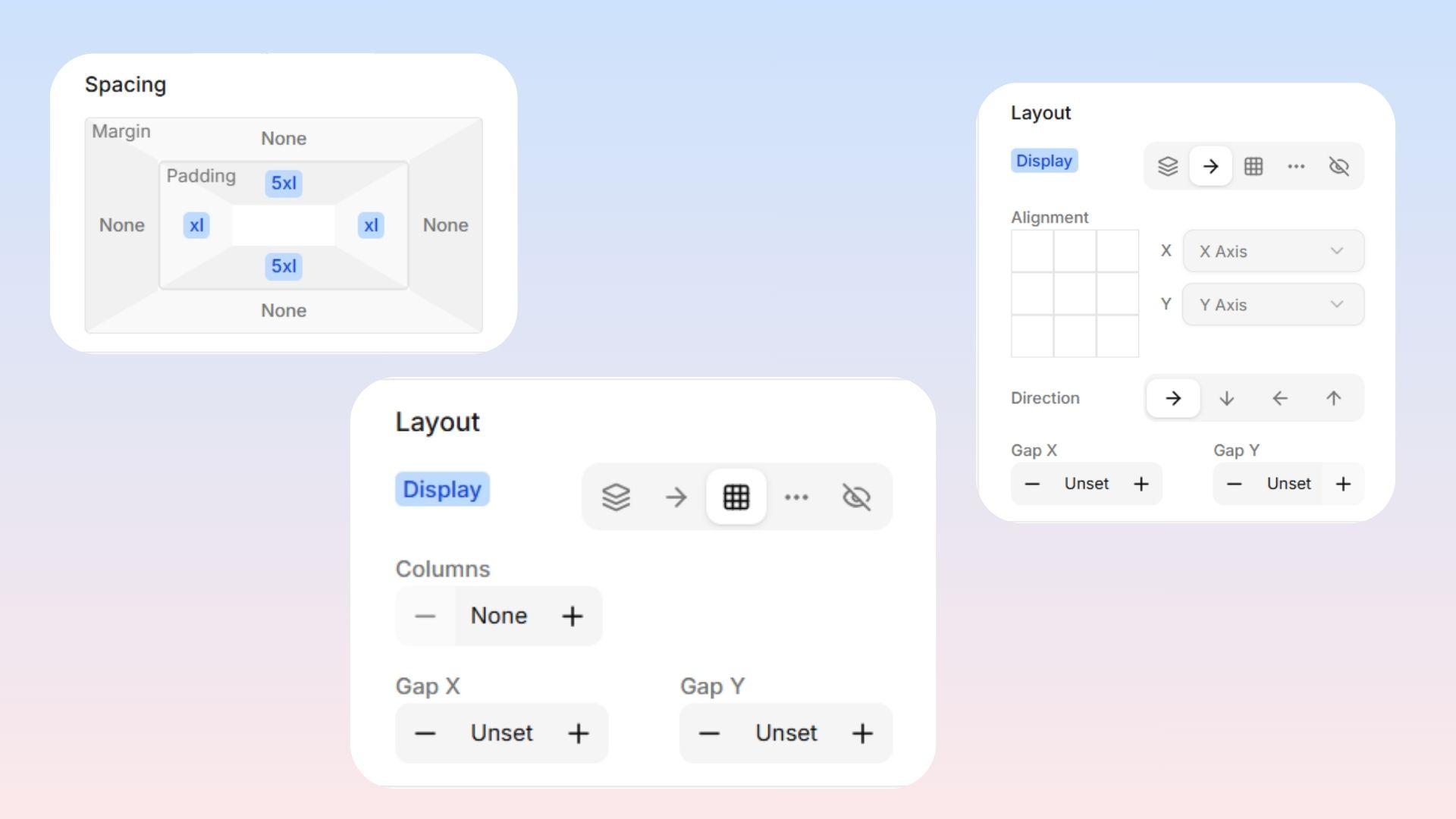
Padding — Space Inside
Padding is the space inside the item. Think of it like comfortable extra cushioning between the outer borders and the content inside.
Margin — Space Outside
Margin is the space outside the item. It acts like a forcefield pushing neighboring items away.
Gap — Space Between Children
Gap controls the space between child items inside a layout container (like a row or grid). Instead of adding margin to every individual item, you set one gap value on the parent and all its children are evenly spaced.
 Quick Rules of Thumb:
Text feels squeezed against the edges of its box? Add Padding.
Two different boxes feel way too close to each other? Add Margin.
Items inside a row or grid are overlapping or too close? → Add Gap.
Predefined Size Presets
Instead of typing in exact pixel values, Levo gives you a full scale of predefined sizes so your spacing stays consistent across your entire website. These sizes are all based on a base spacing unit of 4px and scale up proportionally.
Example
Preset | Label | Default Size |
|---|---|---|
None | None | 0px |
6 XS | 6 Extra Small | 1px |
5 XS | 5 Extra Small | 2px |
Base | Base | 16px |
LG | Large | 20px |
2 XL | 2 Extra Large | 28px |
20 XL | 20 Extra Large | 240px |
NOTE: These sizes are calculated using a base spacing variable, which defaults to
4px. If your theme adjusts the base spacing, all of these sizes will scale proportionally — keeping your design consistent without changing individual values.