Layout & Positioning — Display, Flex & Grid
Table of Contents
Layout controls how items are arranged and positioned on your page. If you have ever felt frustrated and wondered, "Why won't these two things sit side-by-side?" — this is the menu where you fix it.
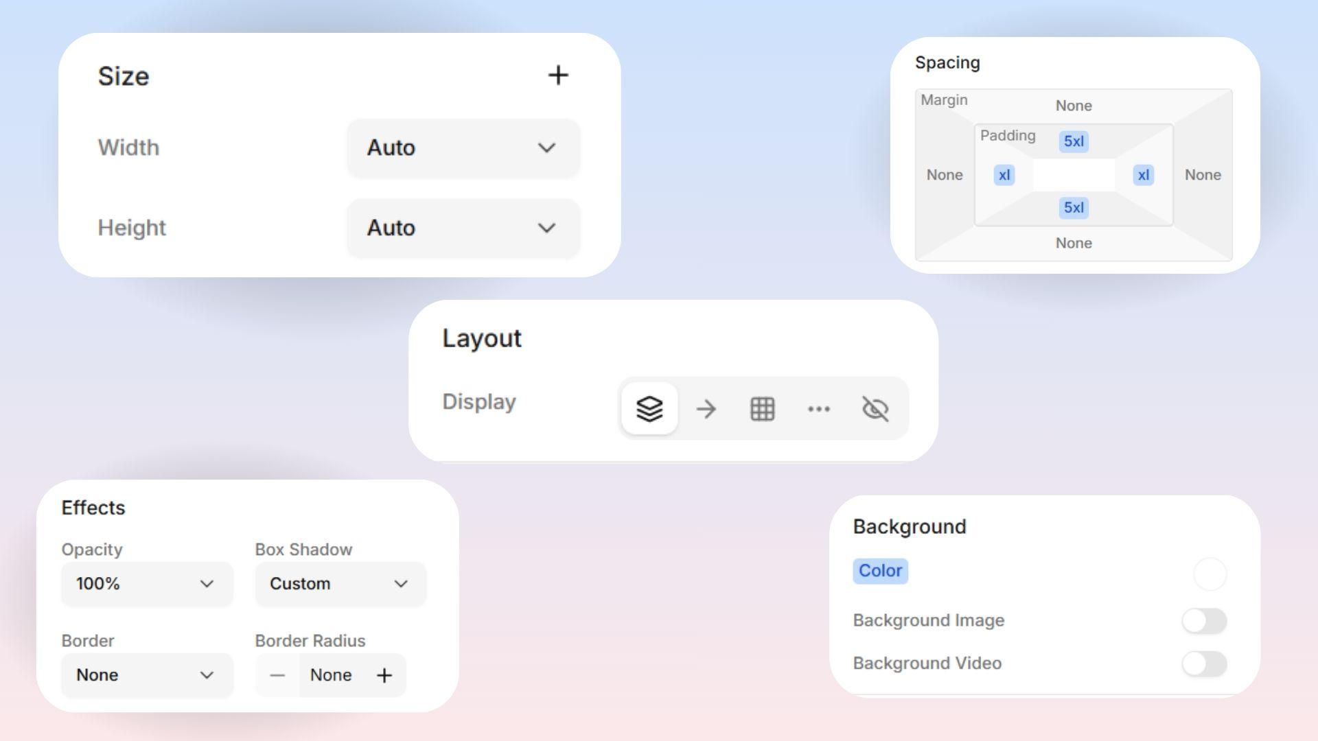
Display
This is your most important Layout tool! It controls how an item acts on the page, and how it organizes anything placed inside of it.
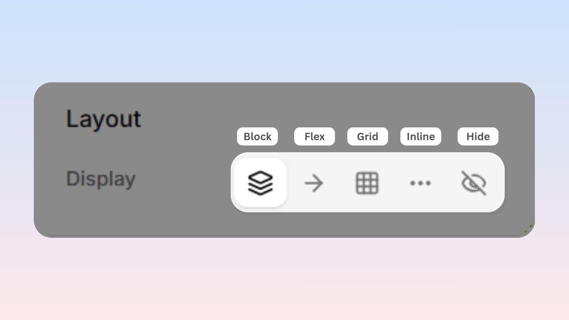
Block: The item takes up the full width of the screen. Anything you add after it will automatically drop down underneath it. This is the default setting for most sections.
Flex: Lets you line items up in a neat row or perfectly stack them in a column. You have total control over the spacing. You will use this setting the most!
Grid: Arranges items into a perfectly organized table of rows and columns.
Inline: The item sits right next to other items on the exact same line, just like a single word acts inside a written sentence.
Hide: Hides the item completely. This is a great trick when you want to hide something on a small phone screen without permanently deleting it.
Flex vs. Grid — Which should I use? Use Flex when you want things in a single line — like a row of buttons or a simple vertical stack of pictures. Use Grid when you need a wider layout — like a neat 3x3 photo gallery or a 4-column row of icons.
Flex
1. Flex Direction
(Visible when Display is set to Flex)
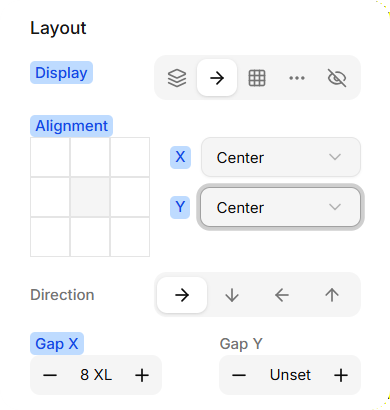
This controls which direction your items flow:
Row: Left to right (horizontal line)
Column: Top to bottom (vertical stack)
Row Reverse: Right to left
Column Reverse: Bottom to top
2. Flex Alignment
These rules help you push, pull, and align items perfectly inside their space.
3. Justify Content
If your items are in a row, this moves them left or right. If they are in a column, this moves them up or down:
Start: Packed tightly at the beginning.
Center: Grouped perfectly in the middle.
End: Packed tightly at the end.
Space Between: Evenly spaced, with the first and last items pushed securely against the outer walls.
Space Around: Evenly spaced, with equal gaps around every single item.
Space Evenly: Perfectly equal gaps everywhere, including the edges.
4. Align Items
If your items are in a row, this moves them up or down. If they are in a column, this moves them left or right:
Start: Pushed to the top or left.
Center: Placed dead center.
End: Pushed to the bottom or right.
Stretch: Stretches the item to fill the entire space.
Baseline: Lines up items perfectly based on the bottom line of their text.
5. Gap
This controls the empty space between your items.
Gap X: The horizontal space (left-to-right) between items.
Gap Y: The vertical space (up-and-down) between items.
 Pro Tip: Using "Gap" is much faster and cleaner than trying to eyeball margins on every single item. Change the gap once, and all your spacing magically updates at the same time!
Grid Columns and Grid Rows
(Visible when Display is set to Grid)
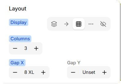
This defines exactly the grid structure you want.
Grid Columns: Set this to 3, and your items will automatically arrange into 3 perfectly even columns.
Grid Rows: Set this to 2, and your items will fill two horizontal rows before wrapping.