Responsive Design (Styling for Different Screen Sizes)
Table of Contents
Every time you make a change in the Style tab, you are actually styling for a specific screen size! "Desktop" is always your main, default view.
The Three Screen Sizes
Levo Studio lets you design perfectly for three different screen sizes (often called "breakpoints"):
A "breakpoint" is simply the point where your website magically changes shape to fit a smaller screen! Every time you make a change in the Style tab, you are styling for a specific screen size.
Levo Studio uses three breakpoints to help you design perfectly for almost every device out there:
Desktop (Above 768px): For large computer monitors and laptops. This is your main, default view.
Tablet (481px to 768px): For iPads and large phones turned sideways.
Mobile (Up to 480px): For standard cell phones.
Switching Your View
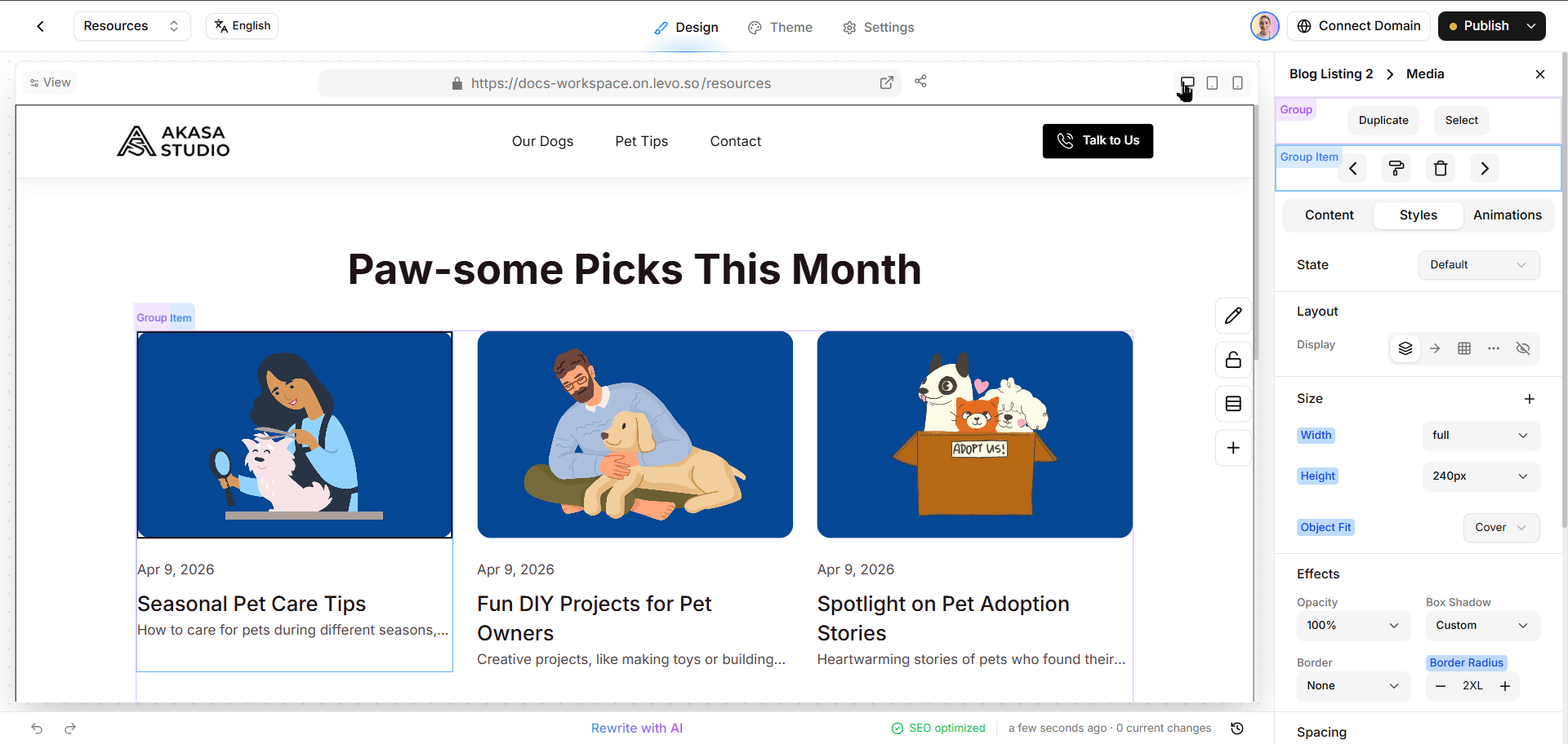
At the very top of Levo Studio, you will see three tiny icons: a monitor, a tablet, and a phone. Click one of these to switch your view!
When you click one, your canvas shrinks down or expands to perfectly match that screen size. If you make a design change while in a specific view (like Mobile), that change will only apply to that screen size!
(Hint: If you never touch this toggle, all your styling changes will apply to every screen size by default!)
How Styles Trickle Down
Designing for three different screen sizes sounds like a ton of work, right? Don't worry! Styles automatically and gracefully flow downwards from massive screens to tiny screens. You don't have to design your entire website three times—you only have to fix the parts that look broken on small screens!
Desktop is your foundation. Whatever you do here applies to every screen automatically.
Tablet simply copies your Desktop look perfectly, unless you make a specific iPad edit!
Mobile copies everything above it, unless you make a specific cell phone edit!
A Quick Example: Let's pretend you increase your heading font size to a massive 56px while viewing your Desktop screen. Next, you swap to the Mobile screen. The text looks way too huge for a tiny phone, so you shrink it down to 28px.
What happens when visitors come to your site?
People on laptops will see massive 56px text.
People on cell phones will see nice 28px text.
People using an iPad will just copy your laptop rules, getting 56px text.
Spotting Custom Edits
Levo Studio uses color labels to help you keep track of your changes across different screens.
Blue Label: This means the setting is the original source of the style (usually on Desktop).
Amber (Orange) Label: If you see an orange label while working on a phone or tablet view, it means you have made a custom edit specifically for that small screen size!
How to Erase a Custom Edit:
Switch to the view where you made the edit (like Mobile).
Find the setting with the amber label.
Click the reset button next to it! The setting will instantly go back to quietly copying whatever your Desktop screen looks like.
Hiding Items on Small Screens
Sometimes a giant decorative picture looks amazingly cool on a huge laptop, but totally gets in the way on a tiny cell phone. You can actually hide it!
How to Hide an Item:
Use the toggle button at the very top to switch to your Mobile view.
Click the item you want to hide.
Open the Layout menu on the right.
Set the Display setting to None.
That's it! The item completely vanishes for people on cell phones, saving them tons of space, but it stays perfectly visible and beautiful for people on big laptops.
Best Practices for Mobile Design
Always design your Desktop layout first. Get it looking amazing, and then switch to Tablet and Mobile to clean up any messy areas.
Hide huge things on small screens! Don't be afraid to use the Display: None trick if something takes up too much space.
Watch the color labels! They will always tell you if you are looking at the original style (blue) or a custom mobile tweak (amber).